How We Used AI to Fix A Client's Bad Logo Design For Free.
Your logo is your handshake. See our process for using AI to design a modern, scalable logo for a client, turning a complex design into a clear brand identity.
When it comes to brainstorming a new logo, AI has become an indispensable part of my process. It started with a logo I designed from scratch for a client that just opened in Fredericton selling Fibreglass pools: Sun Splash Pools. ChatGPT helped nail the concept and even suggested the perfect font to match. The only thing left for me to do was convert it into a scalable vector graphic (SVG).
This AI-driven approach isn’t just a novelty; it’s about working smarter to get our clients better results, faster and cheaper. It allows us to be the lean, effective agency that modern businesses need.
What Makes a Bad Logo? Isn’t Taste Subjective?
The short answer? No.
We often partner with small businesses who’ve had a less-than-ideal experience with a previous designer. It’s a common story: they’re handed a logo but are never guided through what makes a design work.
A perfect example is a client we just started working with, Simply Seamless Eavestrough. They came to us for digital marketing services, but we inherited a logo that didnt’s scale for a wide variety of devices, was overly complex, abstract in a way that made no sense, and most importantly, it didn’t communicate anything about their business.
Here’s a quick breakdown of the problems their old logo had:
- It Was Too Complex: The icon featured several layered abstract shapes. This is a huge issue for scalability. How would that look embroidered on a uniform or as a tiny website favicon or scaled to the size of a badge on the side of one of the company pickup trucks? Not great.
- It Felt Dated: A traditional serif font and gradients made the brand feel old-fashioned, which was at odds with their goal of appearing modern and streamlined.
- The Hierarchy Was a Mess: The brand name, three service lines, and a URL were all crammed together, competing for attention. A logo should offer clarity, not confusion.
- It Said Nothing: There was no memorable tagline or unique selling point to anchor the brand, like “Fredericton’s Seamless Gutter Experts.”

The SimplySeamless Logo was neither simple or seamless.
AI Prompt Engineering for Design Success
With these issues in mind, I sat down to do what people are calling “Vibe Designing” these days—essentially, using our brand strategy that we’ve already developed with the client to guide a conversation with ChatGPT and massage out a clear, compelling concept that aligns with our customer’s vision, values, and core offering.
My initial prompt went like this:
Design a clean, modern, and highly recognizable logo for a company called Simply Seamless Eavestroughing. The business specializes in seamless eavestrough (gutter) installation for residential homes. The logo should convey simplicity, reliability, craftsmanship, and professionalism. Prioritize a minimal, strong design that is easy to scale across truck signage, uniforms, and online platforms. Incorporate subtle visual cues related to eavestroughs, water flow, or roofing — but avoid clutter or overly literal imagery. Emphasize clean lines, geometric balance, and modern typography. The color palette should suggest trust and quality (e.g., shades of blue, grey, black, or metallic tones), while maintaining excellent visibility and contrast. Avoid gradients and complex effects. The logo should look great in both full color and monochrome applications. The final mark should be versatile enough to stand alone (icon) or work with the company name in a horizontal or stacked lockup.

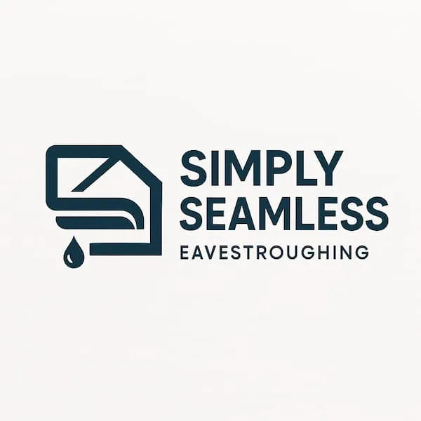
The first version was a good start. The sans-serif modern font choice was more in line with the company’s “Simply” name and the removal of the green gradients for a solid corporate navy blue positioned the company as more competent and confident. But the brandmark looked like a jumbled mess.
a bit too literal and the brandmark wasn’t immediately recognizable. It needed refinement. My feedback was direct and clear:
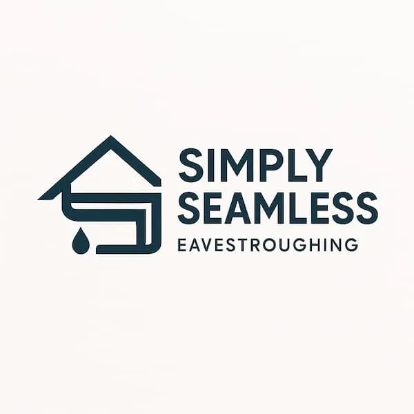
redo the brandmark. I’m happy with the text and troughing subtitle, but make the brandmark more recognizable for being a residential home services company that specializes in eavestrough make the eavestrough more easily recognizable and simplistic enough so that it can scale to various sizes.

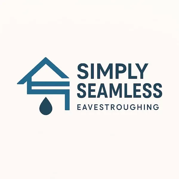
And after a couple more iterations ChatGPT produced this…

Within minutes, we had a strong, adaptable brandmark. It’s clean, modern, and directly communicates what the business does. From here, we can present a powerful concept to the client that solves all the problems of their previous logo—for virtually no cost.
This is what we mean when we say we’re a lean agency built for today’s needs. By working directly with senior marketers and leveraging smart tools, we can focus on what actually moves the needle for your business.
A strong brand is the foundation. Is yours built to last?

