Conway's Game of Life
Invented by mathematician John Conway in 1970, the Game of Life is a cellular automaton where complex behavior emerges from just four simple rules:
- 1. A live cell with fewer than 2 neighbors dies — underpopulation.
- 2. A live cell with 2 or 3 neighbors survives.
- 3. A live cell with more than 3 neighbors dies — overpopulation.
- 4. A dead cell with exactly 3 neighbors is born.
Move your mouse over the grid above to paint live cells. After a moment, the simulation begins and your cells come alive.
Home Services Rebranding: Modernizing a 24-Year Legacy
An established company with a dated look. We modernized the brand with deep blues and a scalable logo system to match their 24-year reputation.
Simply Seamless
Home Services
More Closed Leads
Simply Seamless New Logo
- Initial Status: DATED_IDENTITY
- Turnaround: 2 Weeks
The Project Briefing
Simply Seamless Eavestroughing engaged Enter Design to bridge the gap between their 24-year reputation and their fading digital presence. What appeared to be a simple case of "old branding" was actually a strategic liability—the business was losing market share to younger competitors because its visual identity signaled "outdated" rather than "experienced."
The brand was trapped in an irrelevant green palette, a logo that became illegible on mobile devices, and a "technical debt" heavy WordPress site that frustrated users. Their digital footprint wasn't just slow; it was actively undermining the authority they had built over two decades in the Fredericton community.
This project was not approached as a cosmetic update. It was treated as a market authority restoration .
Initial Site Condition & Risk Assessment
At the time of engagement, the website was built on a bloated Elementor theme hosted in an environment with minimal security controls. The site was not simply underperforming—it was compromised.
- ERR_01 // MALWARE
Active Redirects
Visitors attempting to view the property were intermittently redirected to spam and malicious domains. Modern browsers flagged the site as unsafe.
- ERR_02 // INFRASTRUCTURE
Email Failure
Booking confirmations were routing to spam. DNS records lacked SPF/DKIM authentication, silently severing communication with guests.
- ERR_03 // SEO_DEBT
Index Bloat
Over 1,000 low-quality, auto-generated pages had been indexed from a previous vendor’s black-hat attempt, triggering domain-level suppression.
Technical Recovery Protocols
Enter Design approached the project as a failed system requiring stabilization before optimization. Growth was not pursued until the technical foundation was secure.
Start Your RecoverySecurity & Infrastructure Stabilization
The site was migrated to a hardened hosting environment. We rebuilt DNS records from the ground up (SPF, DKIM, DMARC) and revalidated the property with search engines to clear security flags.
Strategic SEO Cleanup (Subtraction)
Rather than inflating content, we deleted. Over 1,000 spam pages were 410 Gone. The architecture was rebuilt around 50 high-intent pages designed to attract travelers, not bots.
Booking System Modernization
Manual workflows were replaced with a custom Cloudbeds API integration, allowing guests to view real-time availability and book directly on-site, reducing friction at the conversion point.
The Digital Transformation
We moved Simply Seamless from a bloated, generic WordPress template to a custom-engineered performance engine. The shift wasn't just visual; it was a total reconstruction of how the business interacts with customers online.
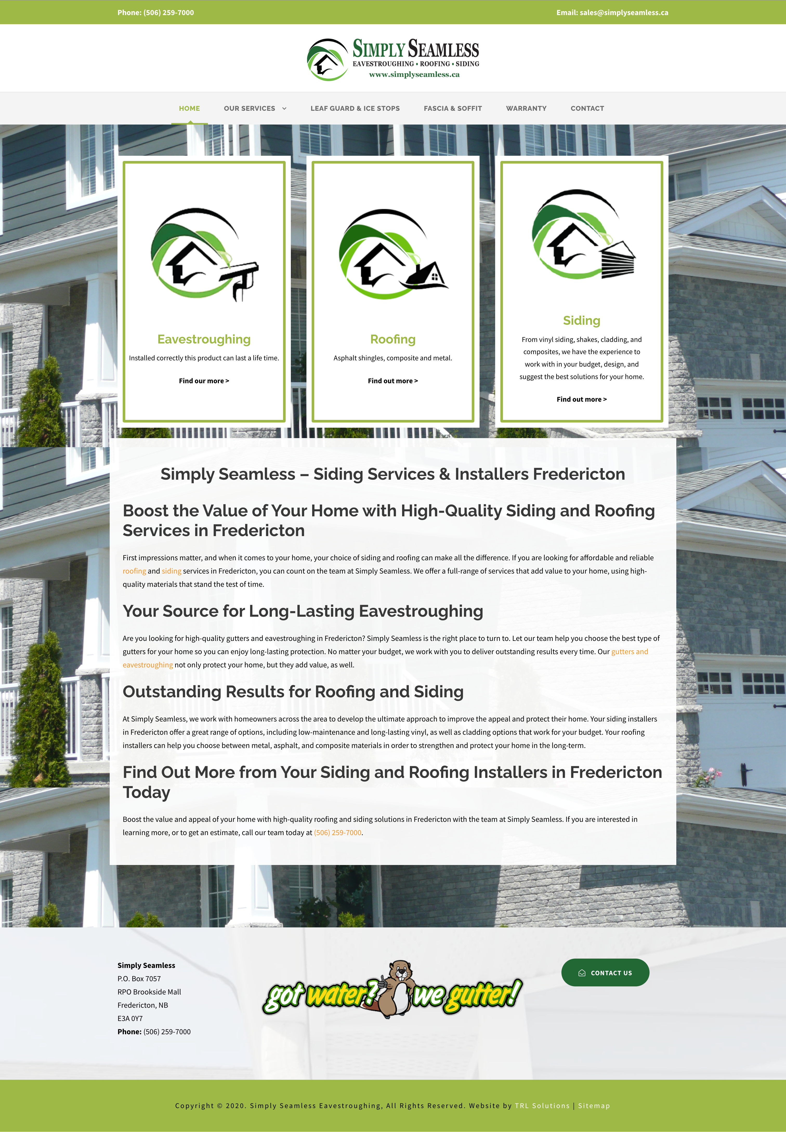
Legacy Environment
- [!] Faded greens and pixelated assets lacked industry authority.
- [!] Slow-loading WordPress build with high mobile friction.
- [!] Confusing navigation that buried the primary call-to-action.
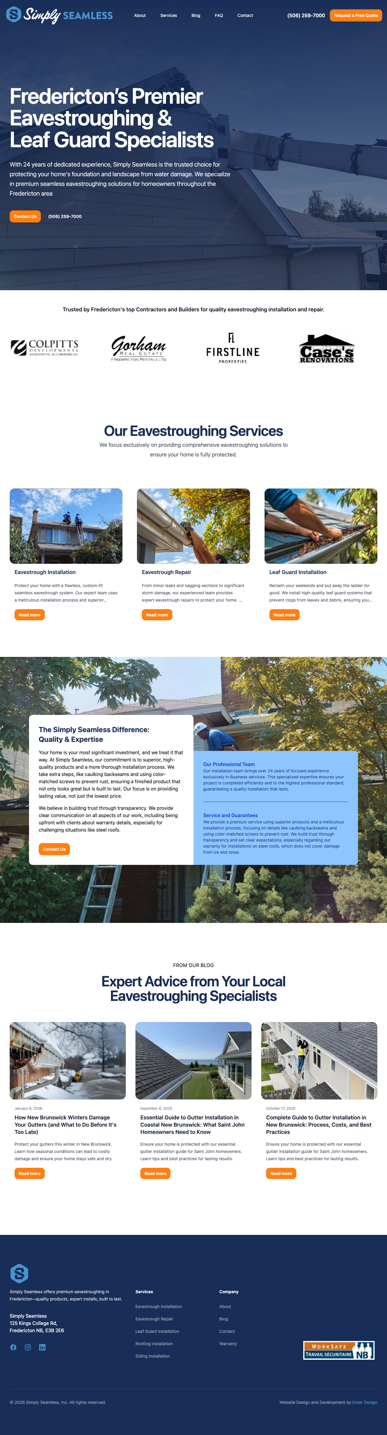
Modern Infrastructure
- [✓] Authoritative Royal Blues and high-definition vector branding.
- [✓] Custom-coded, lightning-fast, and 100% mobile-responsive.
- [✓] Optimized lead-generation funnels for instant conversion.
Authoritative Branding Coupled with Hand-Crafted Code
Enter Design executed a full rebrand and digital overhaul to bring the exterior of the business up to par with the quality of their work.
The Color Shift
We don't write a line of code or design a single pixel until we understand your business. We start by mapping out your ideal client's journey and designing a site structure that makes it easy for them to find what they need and contact you.
Blue communicates trust, authority, and water management—perfect for the eavestroughing industry. It signals that this is a serious, established company.
A Scalable Logo System
We designed a new identity system built for the physical and digital world.
The Brand Mark:
A clean, bold icon that looks sharp on a smartphone header or a social media avatar.
The Legacy Logo:
A full-scale version for letterheads and contracts that proudly highlights their “Est. 24 Years” longevity.
Vehicle Ready:
The new vector assets were designed specifically to be legible at highway speeds when wrapped on work trucks.
High-Performance Web Build
We scrapped the slow WordPress template. We built a custom, lightning-fast website designed to capture leads.
Mobile-First:
Since most homeowners search for repairs on their phones, the new site is 100% responsive.
Lead Generation:
We launched a targeted Pay-Per-Click (PPC) campaign alongside the new site, driving immediate traffic to a high-converting landing page.
Post-Remediation Results
Following the rebuild, performance improvements were immediate. The website transitioned from a technical liability into a secure, index-trusted booking platform.
- Security incidents dropped to zero.
- Average time on site doubled.
- Bot traffic replaced by genuine users.
Organic Traffic
Search visibility cannot be separated from security, infrastructure, and site intent. Shortcuts create debt. Technical clarity creates compounding returns.

Start Your Project
Ready to Redesign Your Website
So it Generates Leads?
Stop settling for a digital brochure. Let's redesign your site so it becomes a marketing asset that generates revenue for your business.